Prudential Website
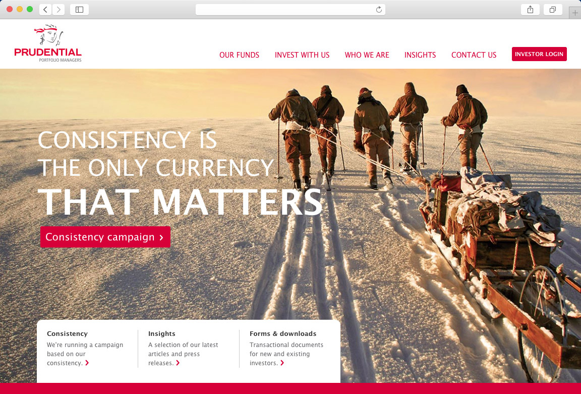
As Prudential's digital partner, Fireworkx was entrusted to develop a site that would create a strong web presence for their new brand image, while substantiate their core identity, of consistency.
As with all successful companies, adaptation to increase web presence is crucial and Fireworkx was able to recognise this need and rise to the challenge: create a great site that blends Prudential's core brand theme of consistency with practicality.
Calmness and consistency
The overall message that needed to be conveyed is that investment relies on strategic thinking – it is something that cannot be rushed; Prudential believe in this method and its success has been proven.
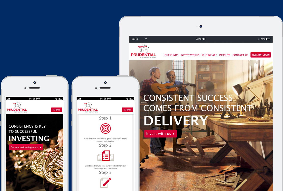
A redesign was needed in order to build a unified site that incorporated an easy-to-use interface with an enhanced user experience, ultimately creating a flow of consistency, which forms the foundation of Prudential's vision.
The practical element needed to be present in the design of the site, but the content strategy had to follow suit. with all successful companies, adaptation to increase web presence is crucial and Fireworkx was able to recognise this need and rise to the challenge: create a great site that blends Prudential's core brand theme of consistency with practicality.
…with the user in mind
We conducted a content audit, discarding unnecessary copy so as to arrive at a simple site architecture.
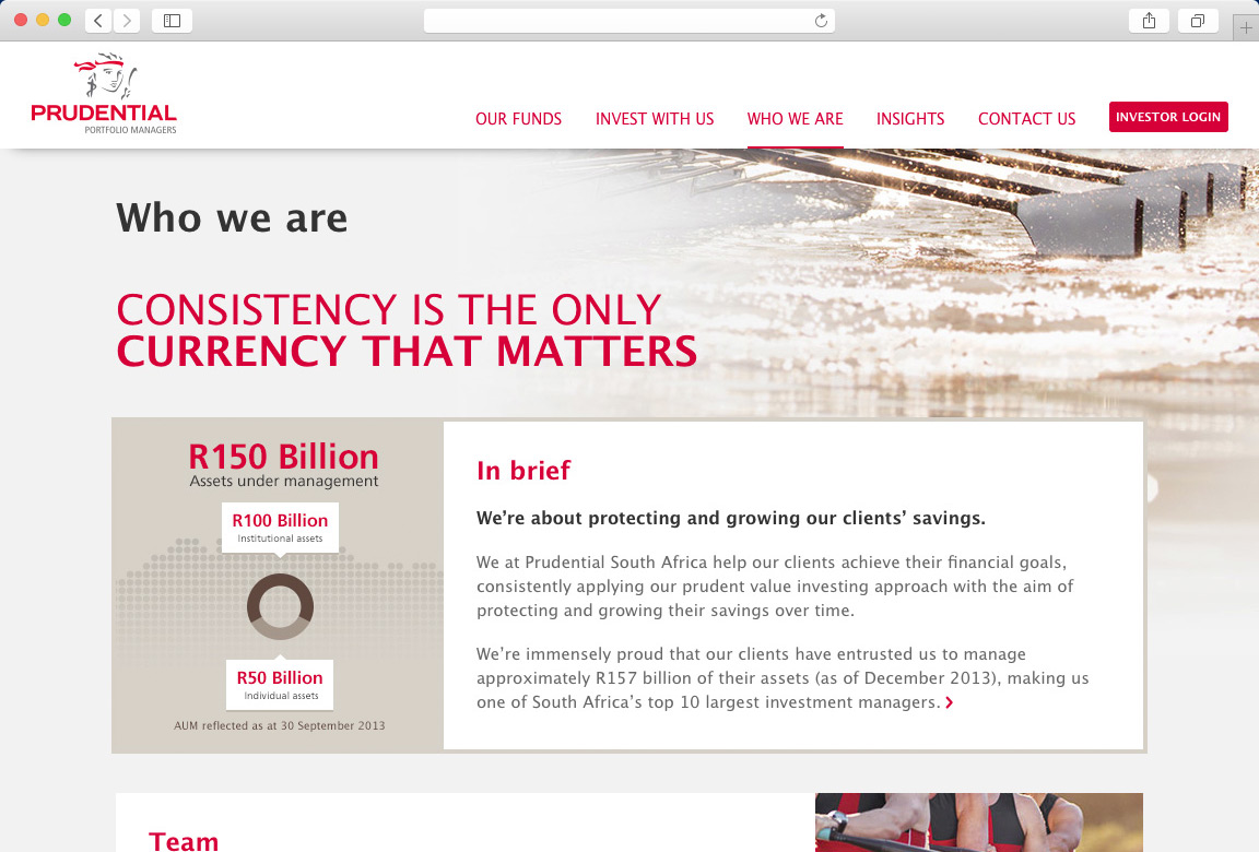
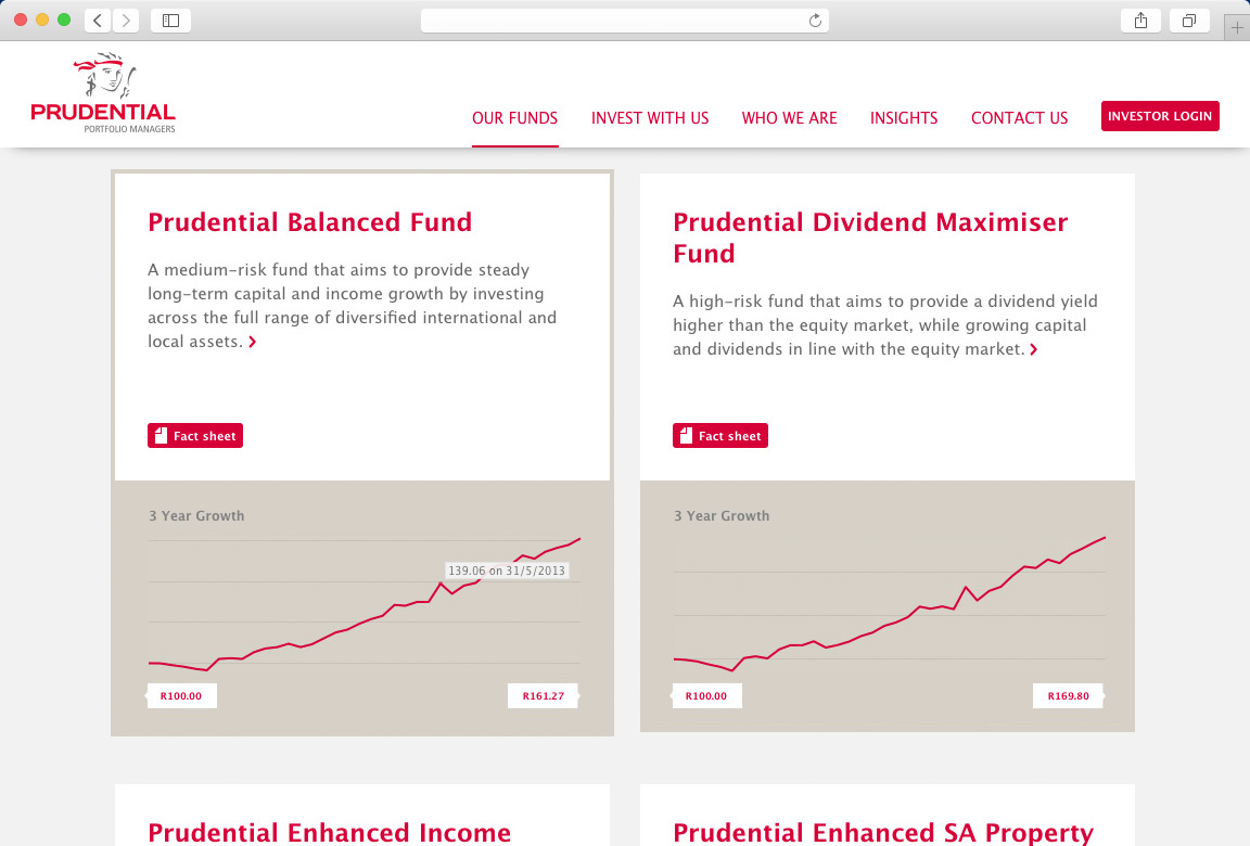
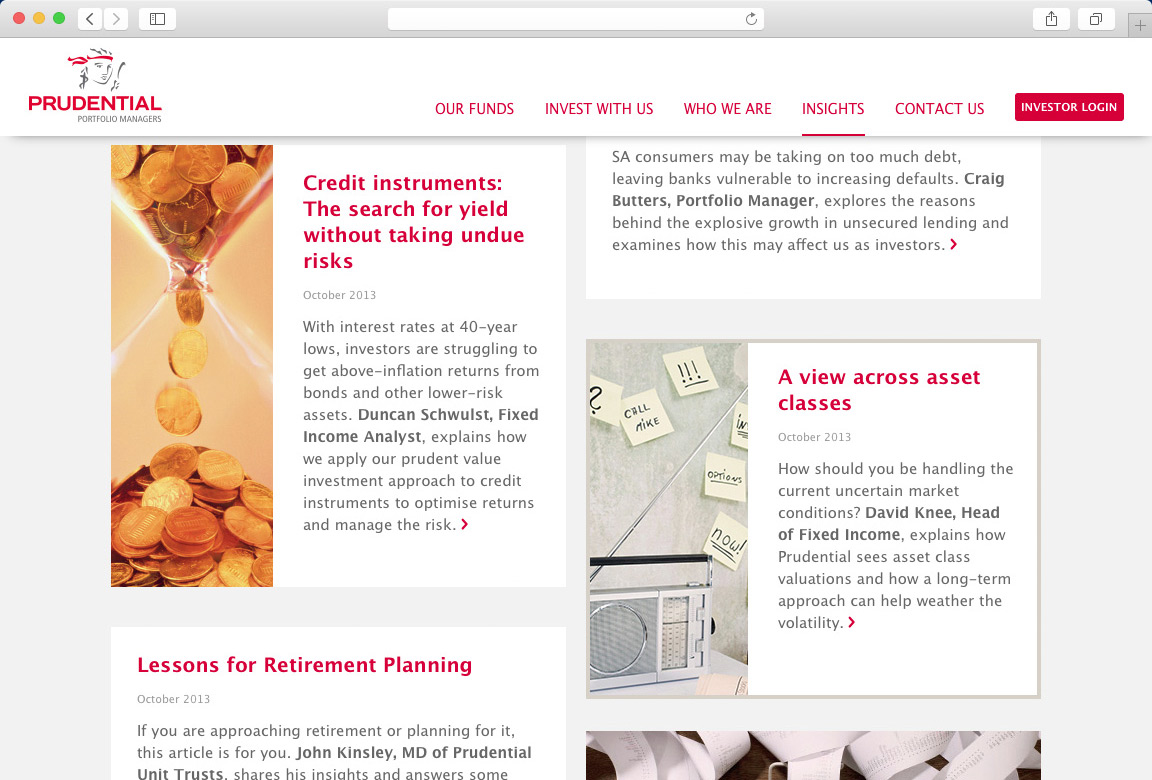
We decided that to enhance the user experience, we needed to follow the concept of 'progressive disclosure', whereby you access the content you need, and only delve deeper if it is required. This method provides for optimal web copy that will keep the readers' attention consistent. A system of 'cards' presents content as a number of quick, easily digestible stories that are aggregated into pages.
This innovative thinking contrasts sharply with competitors whose websites are overloaded with content that has not been strategically placed and will, more than likely, not be relevant.
Getting results
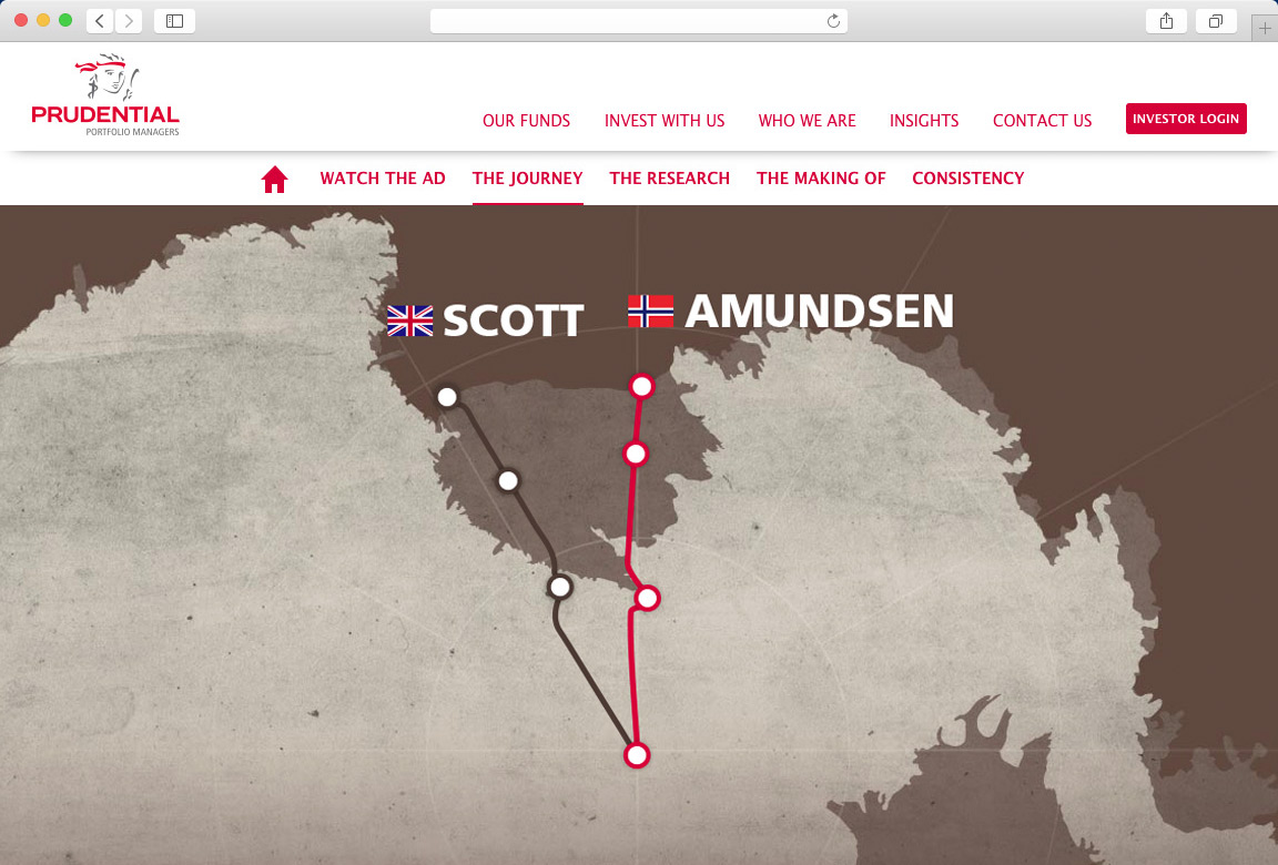
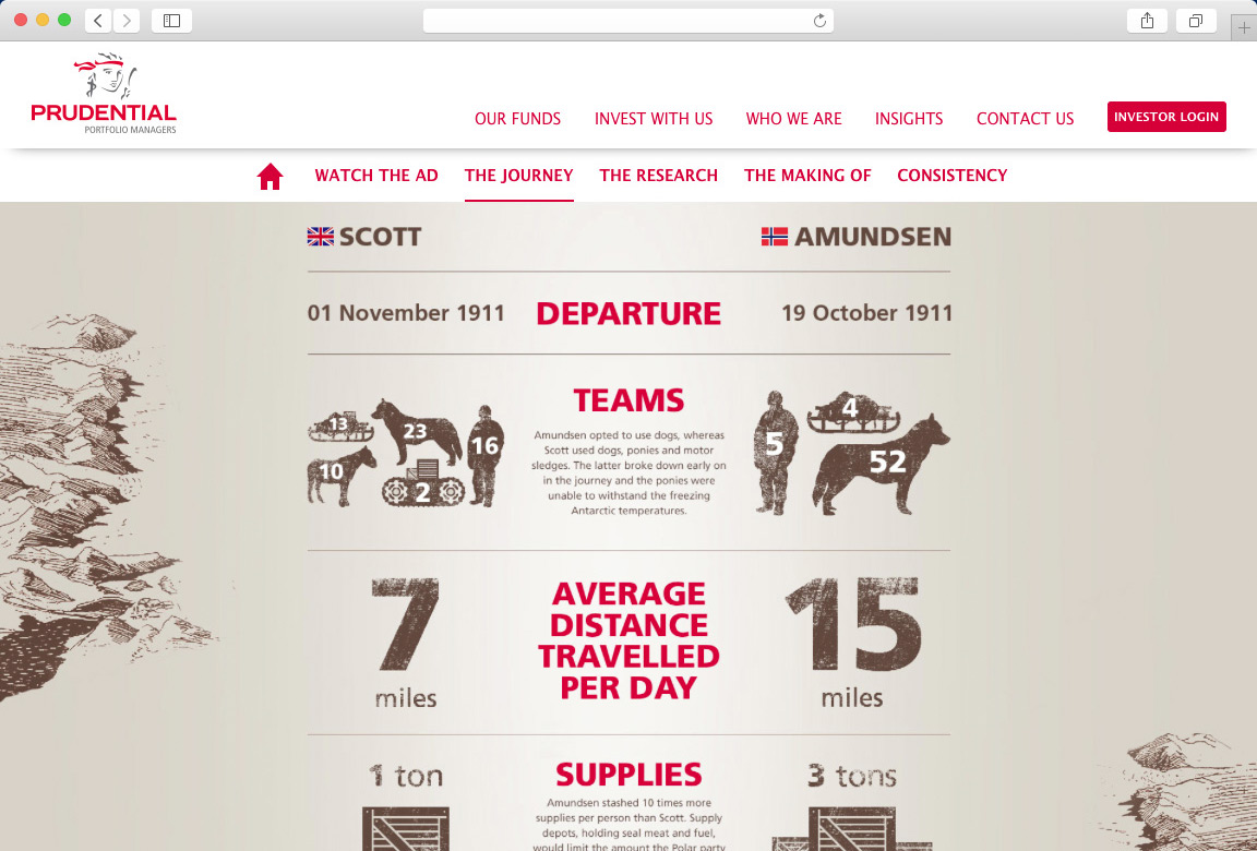
Our methods have proven their value through the doubling of sessions, time on site and number of pages visited since the launch. We have also created microsites to support Prudential's marketing campaigns.
