Ruth Prowse website
Ruth Prowse School of Art selected Fireworkx to create a website that paralleled the school’s practical vision.
When Fireworkx was tapped by the Ruth Prowse School of Art to refresh their site, the objective became clear: like art, the site needed to be a showcase that drew visitors because of its visuals, but it also needed a commercial focus.
We decided that the website should reflect the essence of the school's unique, comprehensive approach of blending theory and practical-based learning.
We decided that the website should reflect the essence of the school's unique, comprehensive approach of blending theory and practical-based learning.
Art meets business
A strategic re-think of how to structure the school's information in a clear and concise way was needed. The challenge was to design a site that would catch the eye of a potential student as well as inspire confidence in a fee-paying parent.
Pioneering design
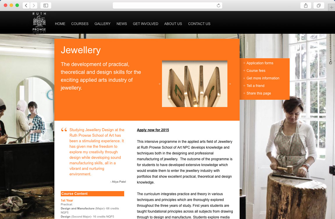
The core visual identity of the website is based around imagery, and so full background images were used to bring this to the fore. The site became one of the first in South Africa to use large images in this way.
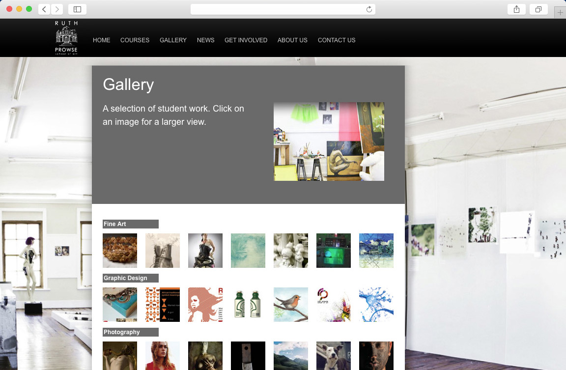
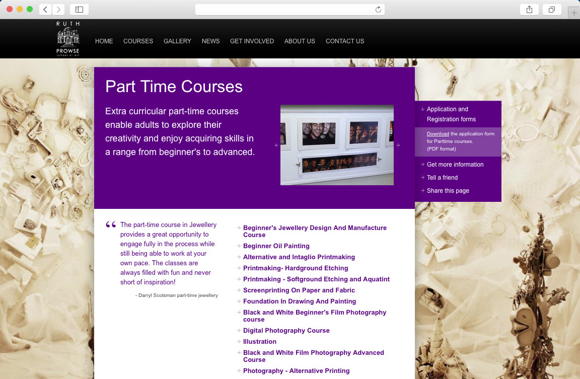
On top of large visuals sit interactive course information panels, detailed course descriptions, colour-coded pages for ease of navigation, and a gallery of student work. The site also has dedicated pages for Part-time and Outreach courses.
The school places great importance around a balance of tradition and innovation and we felt that we needed to stay true to this and have incorporated carefully constructed content that does not overwhelm the site, but has been strategically placed where it is of most value to the reader.
…And here's the proof
The site was a Bookmarks finalist in 2009, gets over 1000 visits per month, and a 21% click rate for part-time courses (the school's bread and butter). Colour-coding has become integral to the school's offline identity.
In short, a simplified more business-like approach, blended with dynamic visuals, allows the site to clearly reflect the essence of the school.
Visit the site
In short, a simplified more business-like approach, blended with dynamic visuals, allows the site to clearly reflect the essence of the school.


