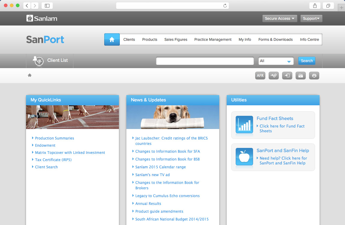
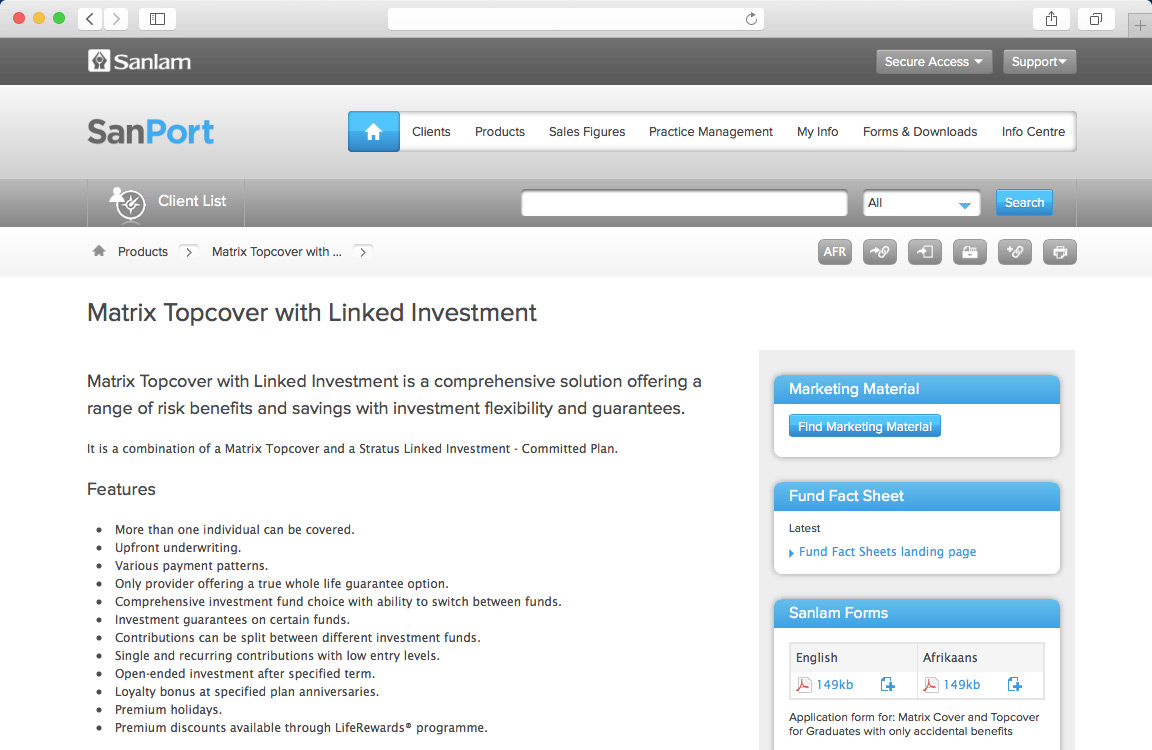
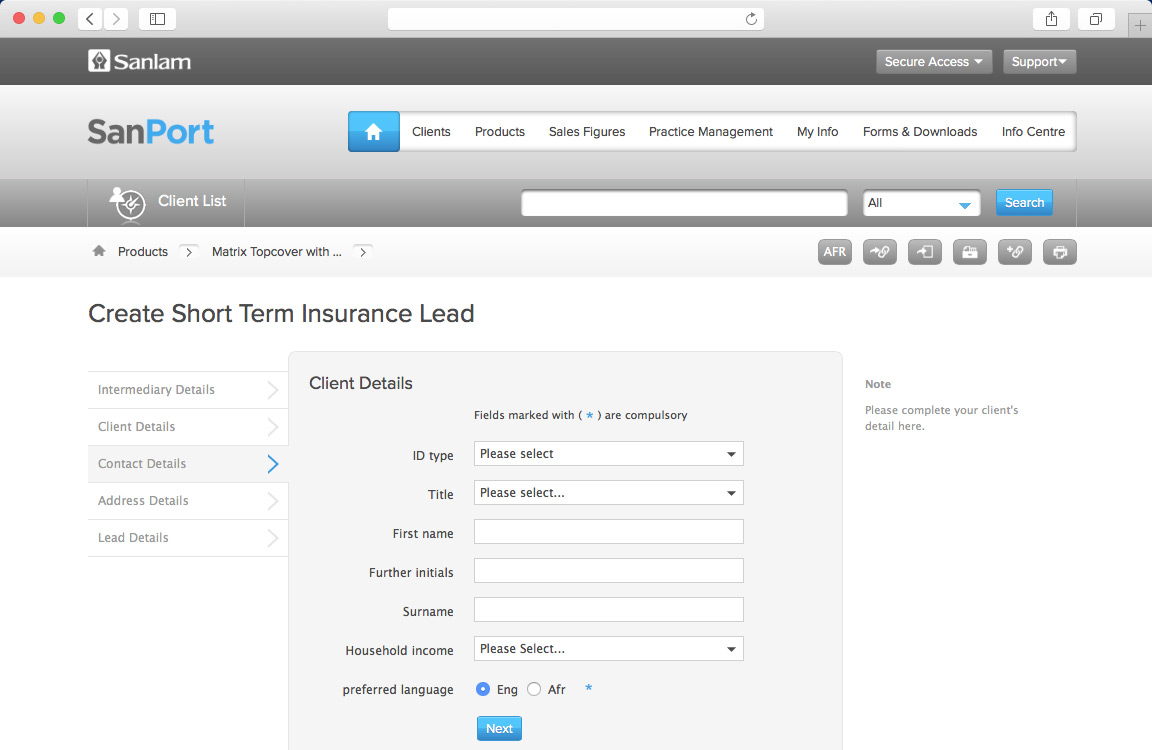
Sanlam Web Portal
Fireworkx was approached by Sanlam to help redesign Sanport – the company’s internal information portal, used by their staff and advisors

We immediately realised the sheer importance for a drastic re-design of Sanport. The portal was essentially a stockpile of 'blanket' copy accumulated over the past decade.
Observe and understand
The portal was a microcosm of an informal settlement – there was little basic infrastructure as well as poor architecture; it was old technology that simply couldn't function in the modern insurance landscape.
For us, the objective was clear: we needed to take a hands-on, anthropological approach and gain an understanding, through actual observation of what the exact needs of the user were before we could advise or implement the necessary changes to create a better user experience…and that's what we did.
We spent time at the premises, observing the daily activities and channels of communication that took place in order for employees to access documents that they required on a daily basis.
The portal was complicated and confusing; we also found that certain patterns emerged such as unnecessary channels of communication that actually hampered the productivity of the employees and the company as a whole. It was agreed that the rocky landscape needed to be redesigned.
The insights that we gained revealed that we needed to create a coherent process. Once our observations were documented, they were storyboarded and presented.
Functionality, naturally
Our focus was to increase the site's functionality by creating a design that reflected the way in which a user would naturally browse and perform routine tasks. In essence, we produced a streamlined user experience that could be seen as a smooth journey, allowing staff members to reach their destination effectively and efficiently.